Behind the scenes
Revisiting a classic: a cinematic exploration of Farnsworth in Lumion
Tell a powerful story through animations with 3D artist Adam Ingram

Architectural Visualization is a powerful medium.
It’s capable of illustrating form and function, allowing designers to convey their complex design ideas in a universal visual language.
But what if we were to go beyond that? What if, instead of attempting to convey an idea, we were able to capture a feeling? An emotional response to a place that we may have never visited yet feel attached to.
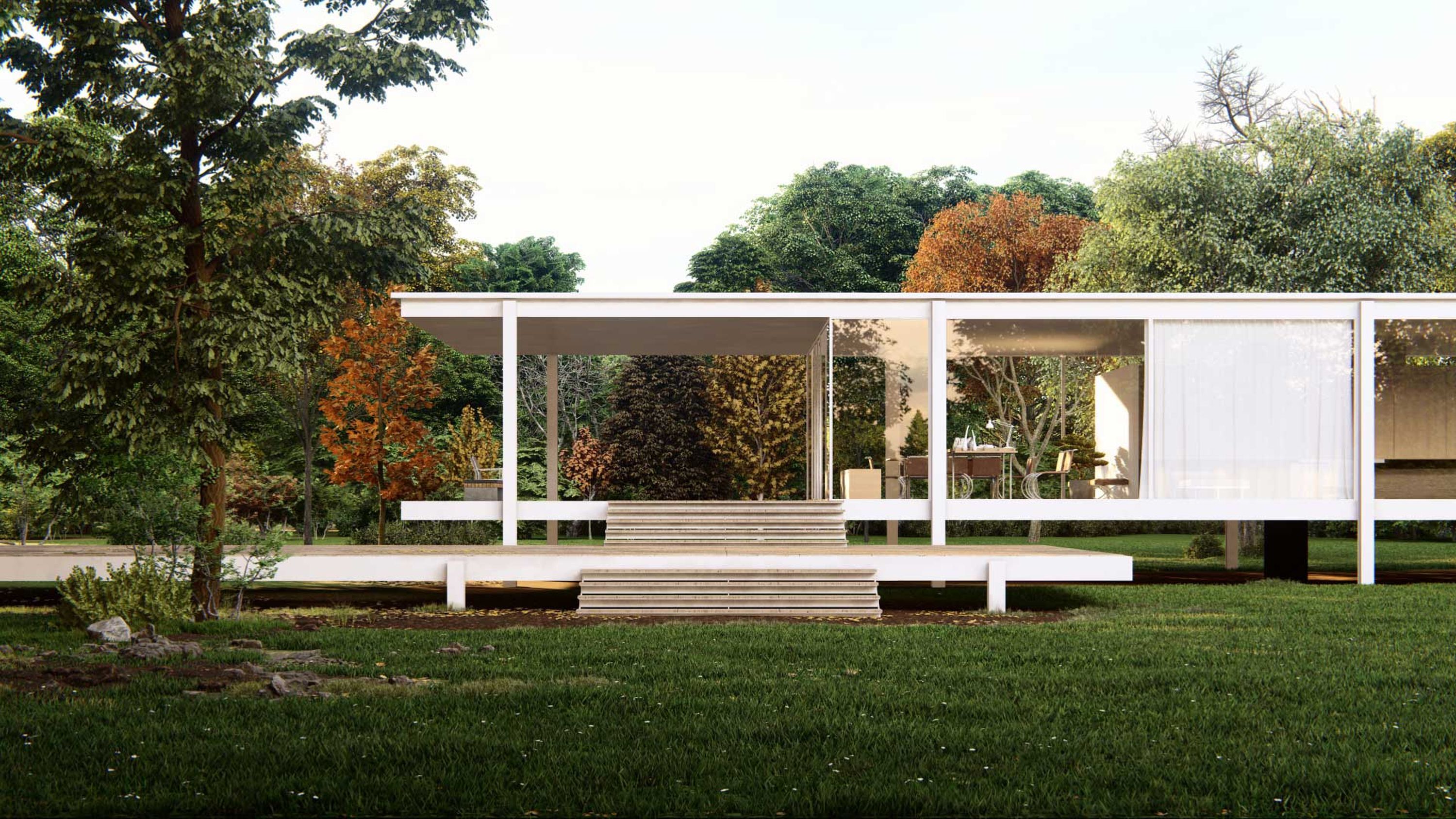
This was the goal for Farnsworth – a collaborative project between Lumion and Adam Ingram (The Lumion Collective), that explores the iconic Edith Farnsworth house in a beautifully crafted animated featurette.
In this article, we’re going to peel back the layers of Farnsworth to better understand the process of creating story-driven architectural animations.
You can find the full animated video below, inviting you to dive deeper into the world of Farnsworth.
Using stories that inspire stories
The Farnsworth building is no stranger when it comes to the world of Architectural Visualization. As an example scene, it’s been used by Lumion artists to learn the fundamentals of 3D rendering for many years and has been re-imagined countless times since.
There is no shortage of reference images when it comes to Farnsworth. 3D reproductions, photographs, and videos are in abundance making the task of collecting references a simple enough process.
Unfortunately, this is also the first challenge that was presented. After sifting through all these images, I was left wondering whether there were any unique parts of Farnsworth left to explore. I decided to look beyond visual references and came across a collection of detailed written accounts of the building as experienced by Edith Farnsworth herself.
One line, in particular, stood out during this process: “It’s as if the glass house itself were an unshaded bulb of uncalculated watts lighting the winter planes”. Farnsworth then goes on to explain in detail how she perceives the ‘cold and uncomfortable’ living spaces in the home.

I realized that the building itself isn’t where the story would lie. It’s how this handful of precisely crafted design elements interact with each other, with nature, and with the occupant; that represents the character of the building.
When it comes to creating architectural animations, I find it helpful to start with a simple overarching story idea. The different emotions that the Farnsworth building has evoked over the years provided a perfect base for this.
The animation was split into two distinct phases. The first phase would draw on the words of Edith Farnsworth and show the building in an unusually ‘cold’ atmosphere. The second phase would contrast this, taking on a more familiar look and showing the architecture as a shining example of modernist beauty.
By starting with one or two basic themes we can then use intentional compositions and imagery to connect these story themes to the building being visualized. With the basic storytelling principles set, I was then able to move into Lumion and begin exploring the scene.
Building the Farnsworth scene in Lumion
Composition
The Farnsworth house has long been praised as a hero of minimalist design. Although this is an impressive achievement, it also brings with it its own set of challenges when reimagining the scene in 3D.
The basic shapes and minimalist decor reduce the volume of what can be shown. As such special care was taken to ensure that each shot is composed in a way that highlighted these minimalist features whilst also driving the story forward.
I find that one of the most useful parts of Lumion isn’t its features, but its ability to be used as an explorative tool in the visualization and design process.

From the moment I enter a scene in build mode, it’s as if I’m walking through the space myself. Sure, there might not be detailed environments or amazing textures early in the process, but by taking control of the camera in this initial stage I’m able to explore the scene from a variety of vantage points, many of which would have been impossible in the real world.
In a few clicks, I can go from being at eye level to an aerial birds-eye view. This flexibility allowed me to see the building from a new perspective and understand how the various architectural elements could best be shown in the final compositions.
With some rough camera views in mind, I was able to start building out the scene, refine the building model, and explore how these different aspects could be connected.
Textures and decals
The material palette in Farnsworth is stunningly simple. The building itself uses only a handful of materials, and most of their visual impact stems from how they interact and respond to the elements.
Weathering is a great way to do this, as it allows me to incrementally build up the layers of detail in a way that anchors the building to the world around it. Imperfections such as rust, flaking paint, and dirt that had built up in the cracks and joints of the building were added using various decals from Lumion’s Decal library.

The workflow of adding decals was straightforward, thanks to the editing options available in Lumion. I could easily adjust settings and build up various layers of weathering with only a few objects.
This small, yet important detail helped add more character and depth to each composition. It conveyed a sense of time and place, a sense of belonging, revealing how the building interacts with its surroundings.
3D Weathering
Details such as moss, grass, and leaves helped to add a new layer of depth to the surfaces of Farnsworth and worked towards creating a space that felt alive.
I used a mixture of Decals and Lumion’s library of nature models to add these features, experimenting with variation where possible to mimic the unpredictability of nature.

To finish this process off, I applied weathering effects such as the precipitation effect to create puddles and ponds in random areas of the scene to help bring the different phases of the animation together and provide continuity between each clip.
With the physical details of the scene set up, the next challenge was establishing the ‘Global tone’ of the scenes.
Global tone
‘Global tone’ is a term I apply to the universal elements that set the tone of the scene. These include things such as weather systems, lighting, and atmosphere.
These elements create the necessary conditions to set the scene into context and tie everything together into one cohesive world.

By using a combination of the Real Skies and Skylight effects, I was able to quickly establish an evening shot that’s reminiscent of the moments just after the sun has disappeared over the horizon.
This isn’t the typical ‘blue hour’ shot. Instead, we’re only just able to make out the details of the building. It’s the moment when the eeriness of the night sets in, and when combined with an expanding overcast sky, we’re left with an anticipation of what’s to come.
Bringing Farnsworth to life
As the rain arrives, it signals a release that begins with the weather then extends to the viewer, bringing with it a desire to settle into the comforts of shelter.
The lighting inside is dim, with a fireplace and a few select lamps lighting the interior. The trees sway in the wind and we see a thick blanket of clouds being pulled across the sky.

As the rain starts, we are yet to see the building. Instead, we learn how the environments surrounding it interact with each other. The faint drops of rain breaking through the tree canopy litter the ground with water droplets as puddles start to form on the dense undergrowth of leaves and debris.
It’s these seemingly insignificant details that create mood and atmosphere, grounding us into a new reality. A world that feels alive.
As the weather approaches its peak, various audio elements are used to build tension. An orchestra of natural sounds builds to a crescendo despite the calm musical track that accompanies the visuals.
As we move inside, we’re instantly protected. The glass walls surrounding the building feel like an invisible shield, yet maintain a constant connection to the environment. The clean, minimalist decor feels more inviting than ever, contrasting with the stormy weather outside.
Just like its real-world counterpart, each detail feels expertly crafted and populated with precision. The scenes that follow emphasize this, using pops of light to draw the eye toward the various design details.
As we get closer, we start to realize how even in this perfectly curated space, the cracks of time start to show.

Lingering fingerprints on the pristine metal surfaces, Worn cracks on the leather upholstered furniture. The accumulation of scuffs and marks on the floor. These are all subtle reminders that despite the precise attention to detail in protecting the interior from the elements, it cannot be protected against its occupants.
As we move to the second phase of the animation the tone has shifted. Sunlight beams through the trees and the sounds of birds and insects replace the rumbles of rain and wind.
We see the environment in a new light, and with it, glimpses of the iconic exterior begin to reveal themselves in the light of day. It starts small, with the simple shapes of the roof and patio fighting for attention as they creep from behind the dense greenery that surrounds the building.
It’s with the reveal of the building that we understand how the sea of autumn-hued trees interacts with the architecture.
It’s no longer a collection of stark white platforms and walls of glass. It’s a blank canvas and a reflection of the world around it.
We see the aftermath of the weather event from the night prior. Scattered leaves across the rain-stained travertine pavement give life to the moss and weeds that found their way through the cracks.
The painted steel platforms show their age as the rust beneath begins to rise to the surface and taint the otherwise spotless materials, giving the impression that this pattern of rain and sun has been a recurring cycle for the Farnsworth building for many years.

These are the details that bring a rendered image to life.
They help create that familiar feeling and connection with the design that can elevate an architectural animation from a simple presentation of form and function, to a memorable, emotive experience.
Tell your own stories with Lumion
We’re thrilled to have worked in this collaborative animation for such an iconic home that has been enjoyed by the Lumion community for many years.
We hope that you enjoy the Farnsworth animation and feel inspired to carry this form of storytelling into your own Lumion projects in the future.
If you’d like to know more about the technical process behind Farnsworth and learn about some of the unique methods that were used, Adam has a scene-by-scene breakdown on The Lumion Collective website. You can find that article here: The making of Farnsworth.
About the author
Adam Ingram is a story-driven 3D artist, educator and creative director specializing in architectural visualizations for nearly a decade. He is the creator of The Lumion Collective, a project that aims to help designers and visualizers tell better stories through visualization. Adam regularly shares his experience and knowledge with the wider community, helping thousands of like-minded 3D artists to perfect their craft.
Follow Adam @thelumioncollective for more inspiration and tips.


