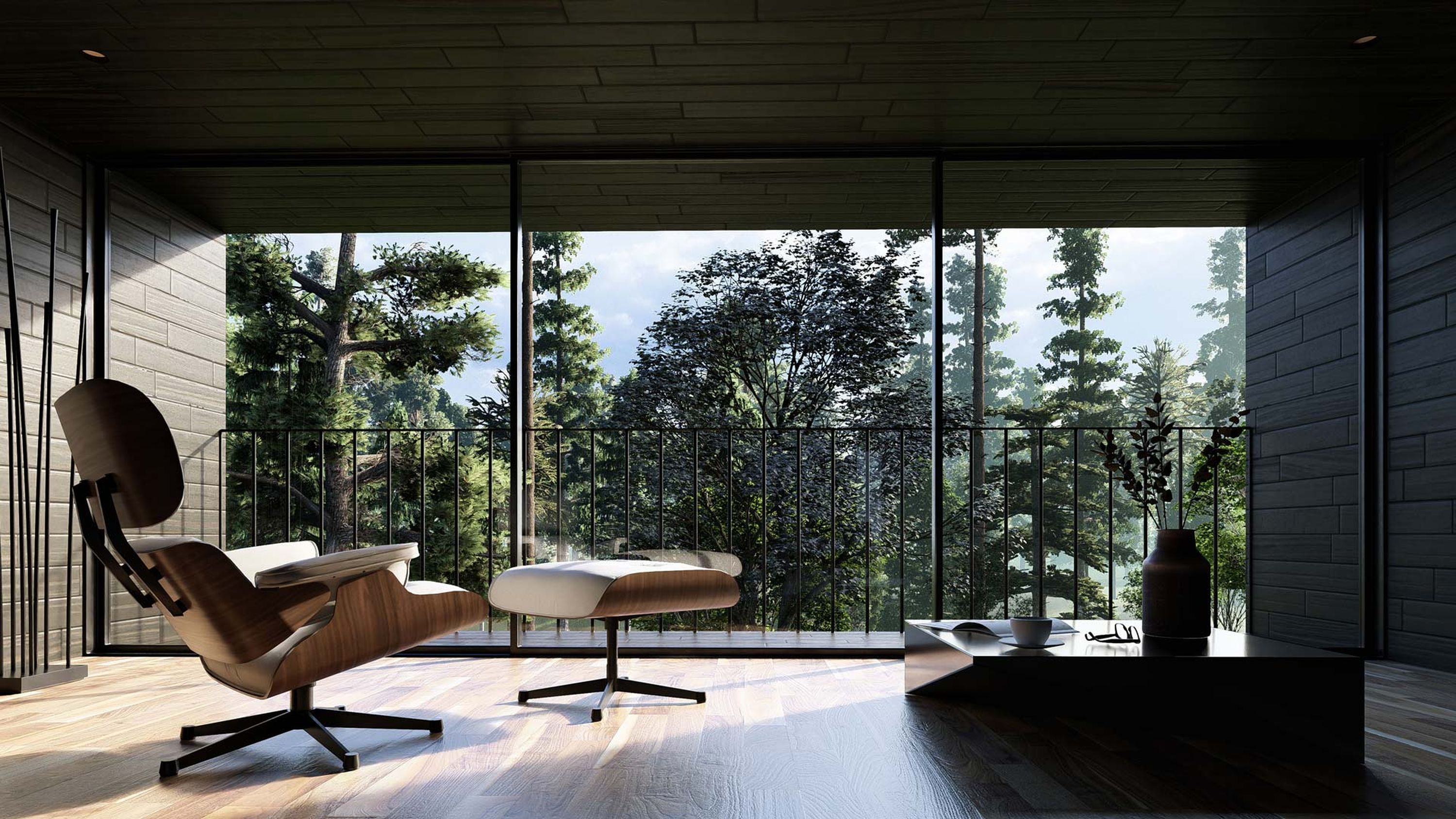
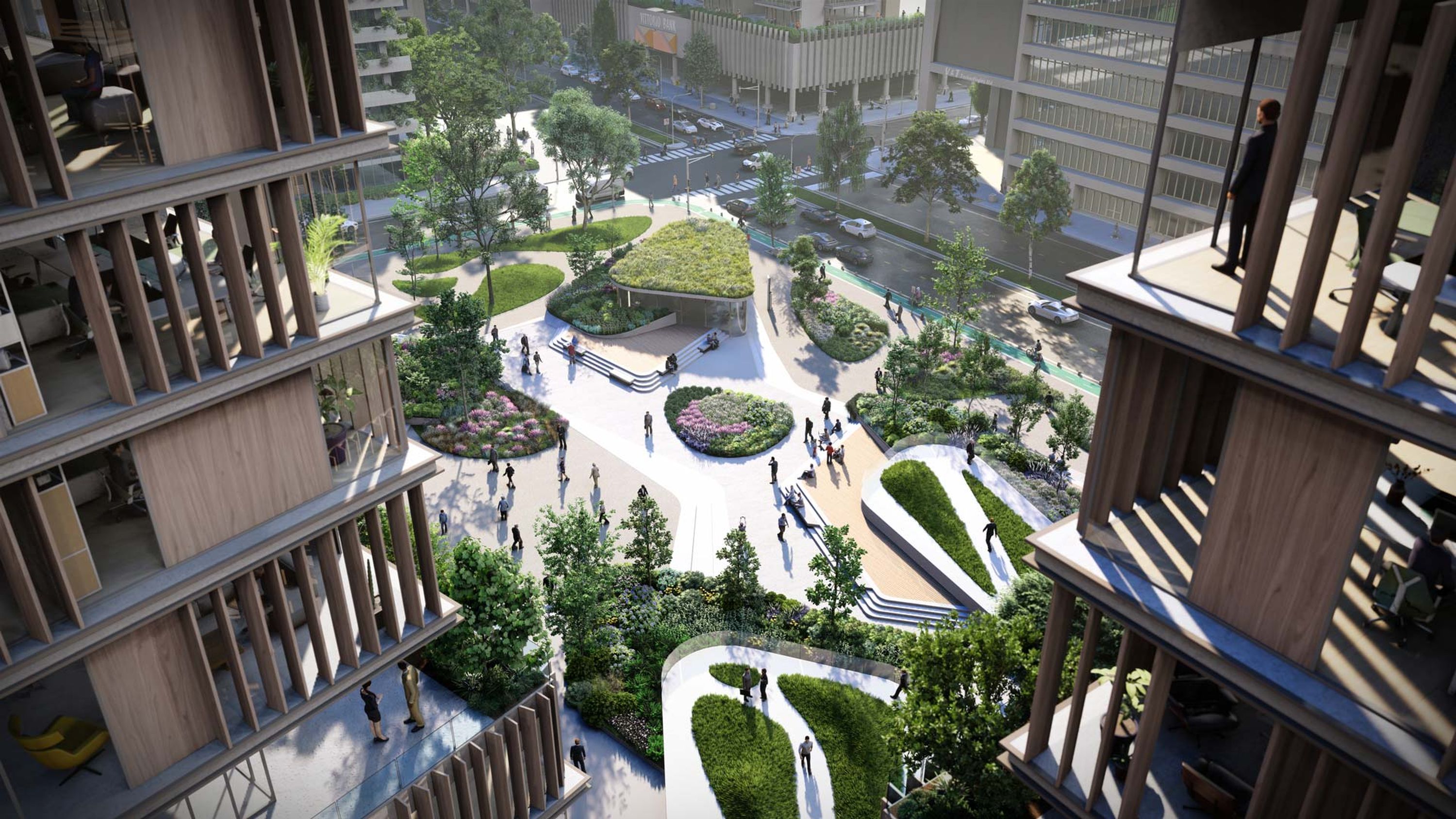
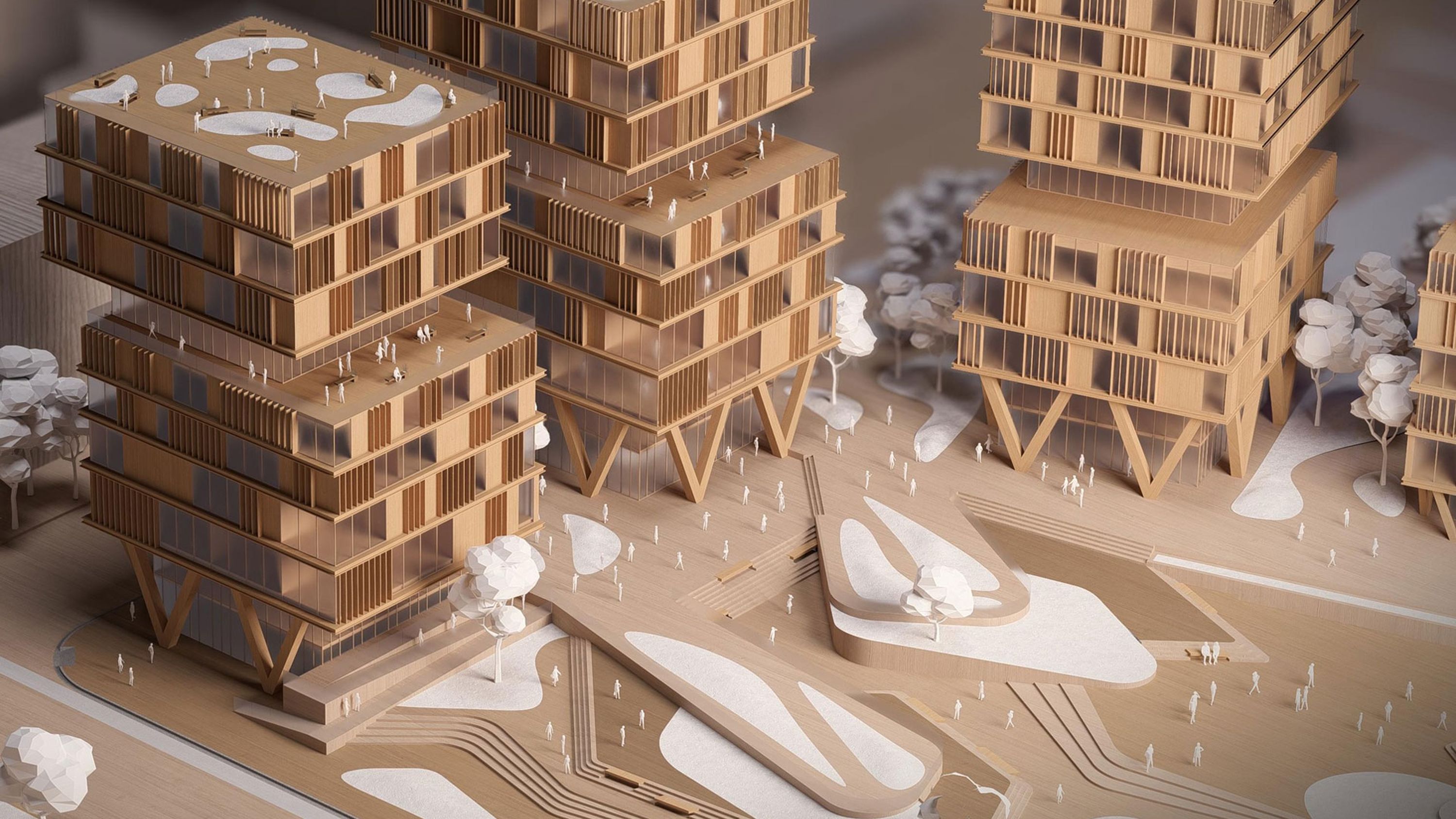
Guide to visualizing interior designs
Discover how to create interior renders with Lumion
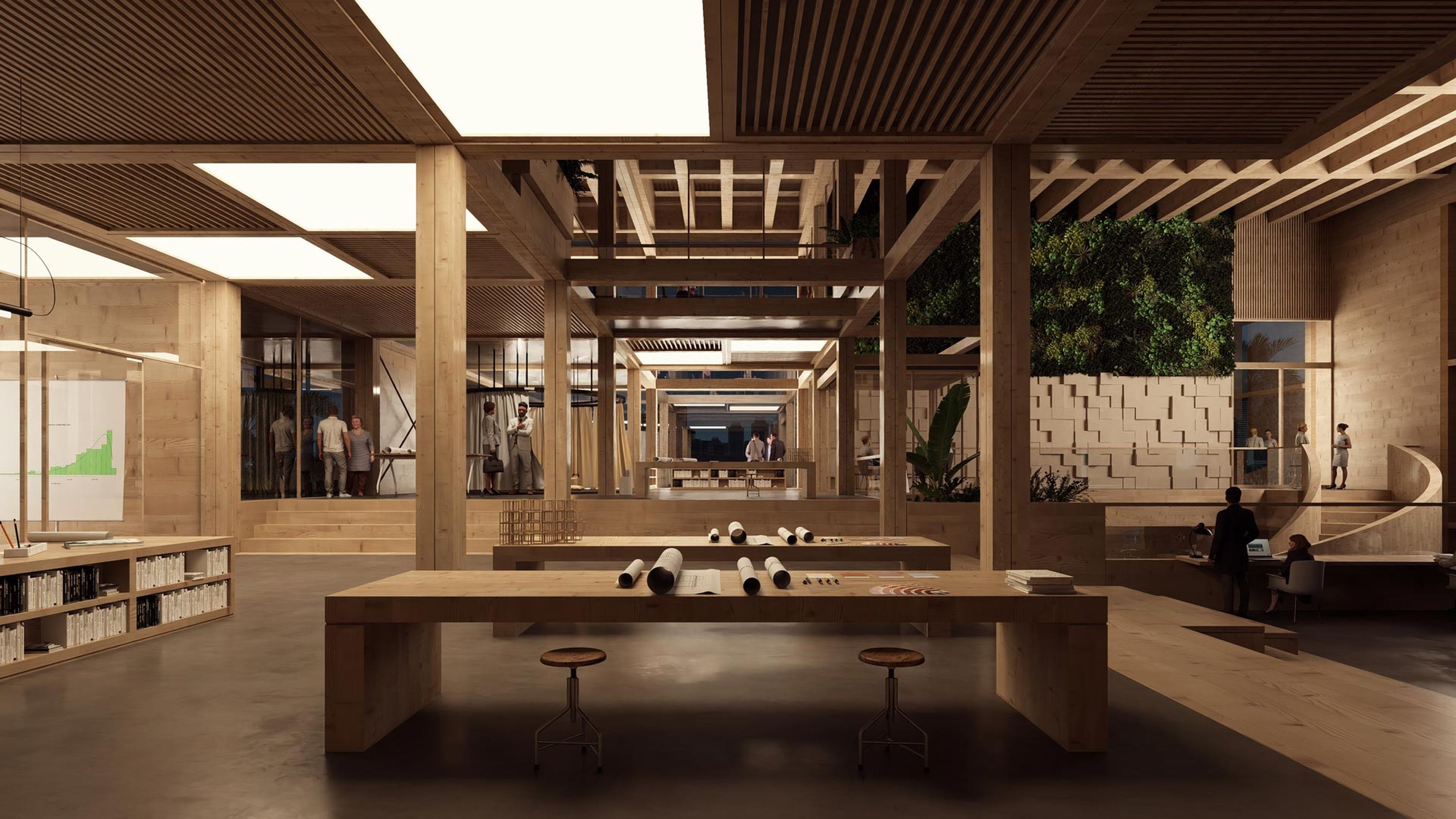
A world of possibilities
Capturing the true spirit of an interior space is easy to achieve with Lumion. The vast catalog of library materials, items, and models at your disposal means that you can let your imagination run wild. Whatever dream interior you feel like building, visualize it inside Lumion.
This easy-to-follow guide offers some simple steps to follow when building interior scenes in Lumion. Keep these tips in mind and you’ll be crafting interiors worth inhabiting in no time at all!
Let’s get practicing!
Video tutorial
Scene building basics for interiors
To help give you a quick insight into how to build compelling interior scenes with Lumion, we have created a short introductory tutorial.
Follow along with our video and we will help you craft a quality interior scene in under ten minutes!
You can find the 3D model, and other resources, available to download here.
Find the best angle
As with any other aspect of architectural design, creating a stunning interior render will require careful camera positioning. Selecting the most interesting angles, and setting up your workspace correctly in Lumion, will help you to avoid redundant work and having to add unnecessary details. Keep the focus clearly on what you want to show to the client.
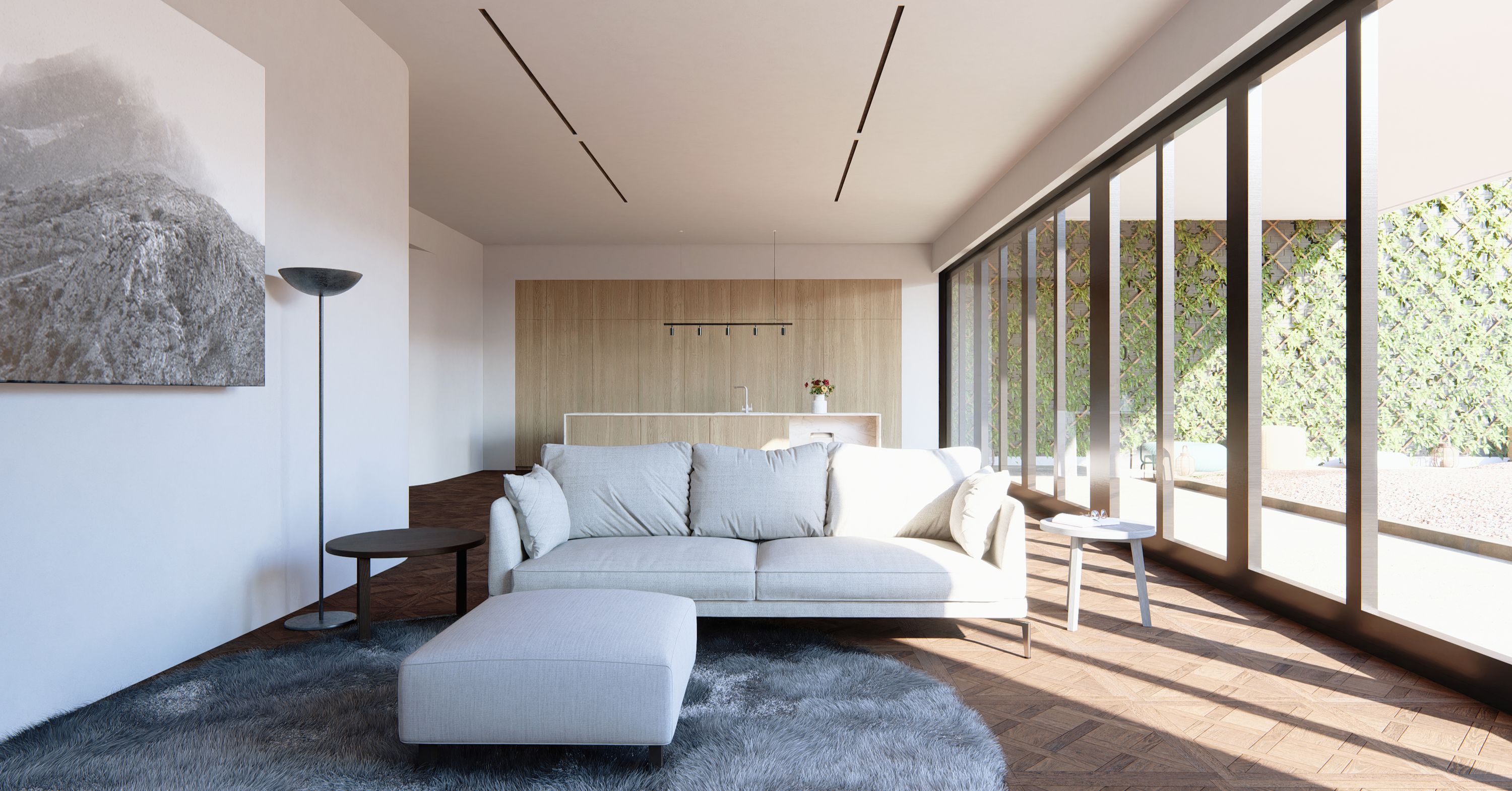
In Photo mode, play around with the camera and focal length to find the best view.
Pro-tip: a shallower focal length often works better with interior spaces as it can make a narrow space feel wider. It can also help to make minimalist designs more striking.
Populate the space
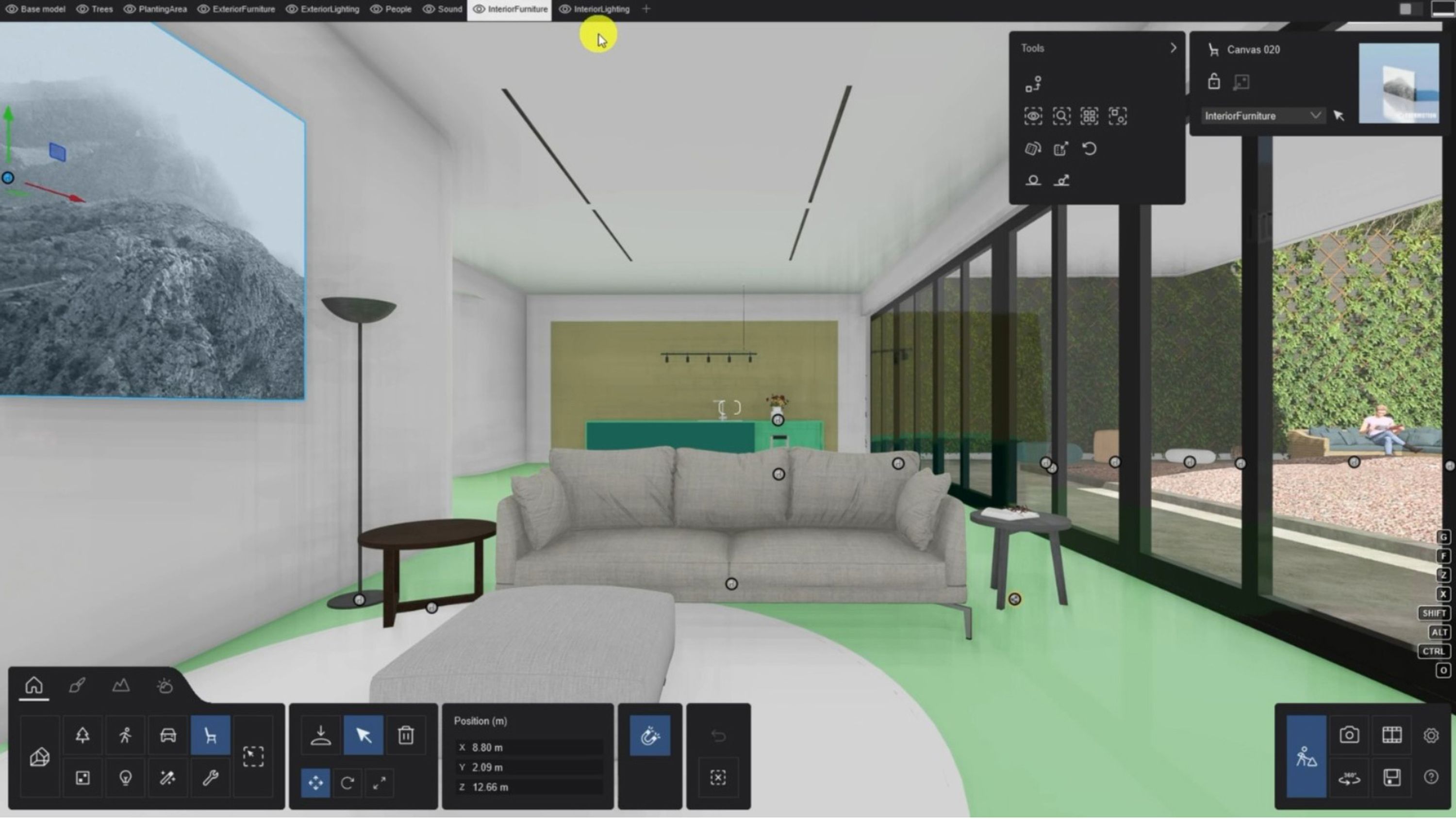
Adding a bit of context to your space can really enhance an interior. A few carefully placed context items can really help to create a fuller story and add some depth and realism to the final image.
Your goal, for all interiors, should be to create a space that feels inhabited, or that you would want to inhabit. The Lumion library provides plenty of options to populate your scene with.
Simply browse the categories, or search for something specific. Select the items you find suitable and place them into your scene.
Of course, if you change your mind, you can use the Replace Model option to switch an item out for something different.
Group your assets
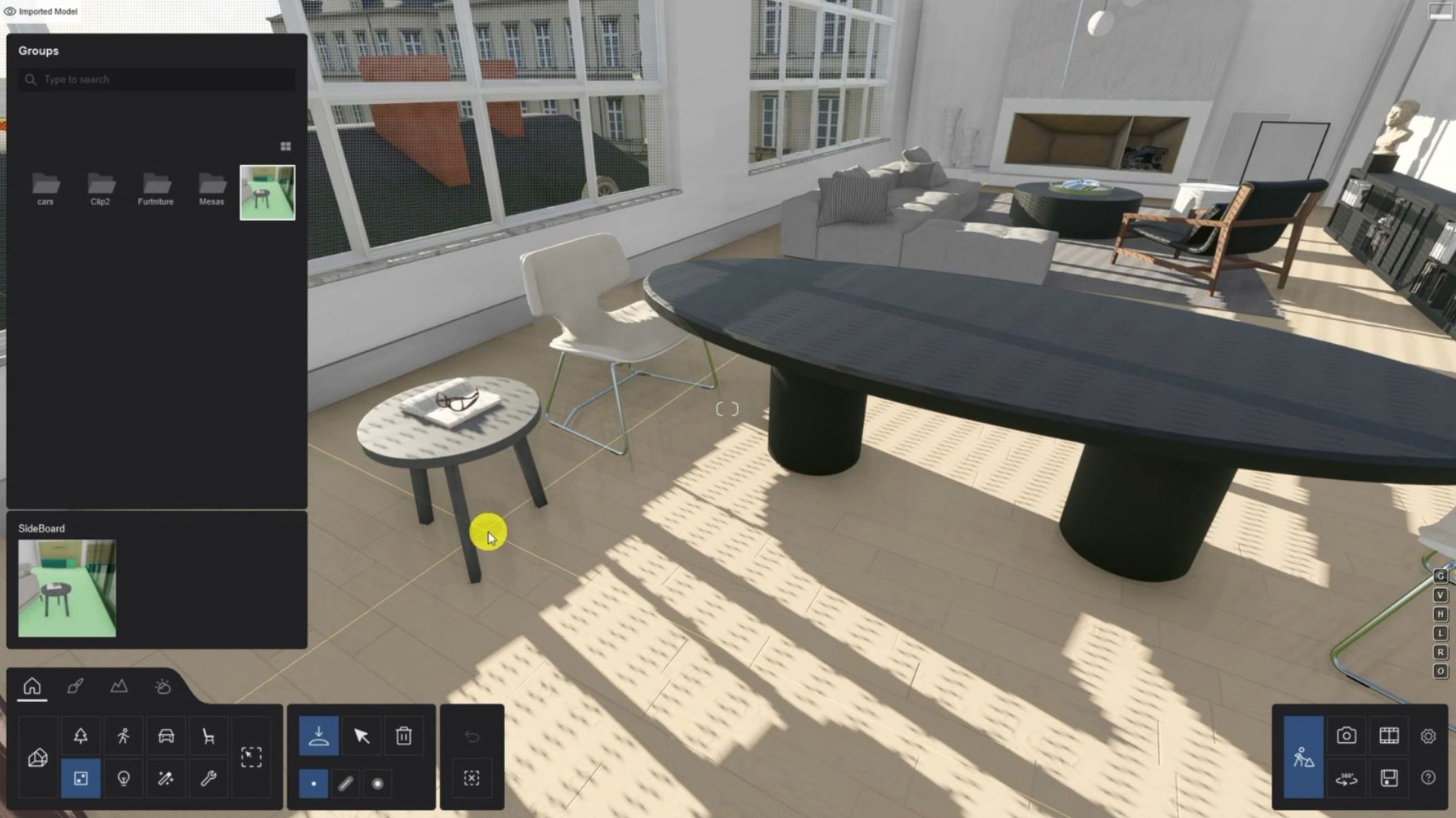
In Lumion, you can save selections of Library items into the Group Library, for ease of access and for repeated use across multiple projects.
Pay close attention to the light
Try to find viewpoints that contain plenty of natural light, or receive enough artificial light to create an evenly lit scene. Be sure to pay close attention to shadows that are created by natural light. Another good tip would be to experiment with lighting the scene at night, with simulated moonlight, to see how the light and shadow areas play with each other.
The Lumion Library contains 3 main light types:
Spot Lights
Omni Lights
Area Lights
Each of them can be useful in different scenarios and all are easy to work with.
In our tutorial example, we added a few spotlights. With spotlights, you can change the cone angle to alter the width of the area the spotlight is affecting. You can also adjust the brightness to your liking.
These are the two main settings, but there are others, which include:
Enabling and disabling the light source. If it is enabled, you can increase the radius of the light source.
Orienting the spotlight’s direction
Allowing for night activation
Setting the quality of the shadows
Increasing the shadow exclusion zone
Loading an IES profile
Our tutorial does not use an omni light, but it's worth highlighting them here. Think of an omni light as a point that emits light in all directions. Aside from not needing a cone angle, it works in much the same way as a spotlight.
It made sense to add Line Lights into the recessed areas of our tutorial model. Adding a few around the room and setting them to a fairly low brightness allowed us to add complexity to the space without adding clutter. Understanding how light plays within your room will really help you to pull a render into shape.
Give care and attention to your materials
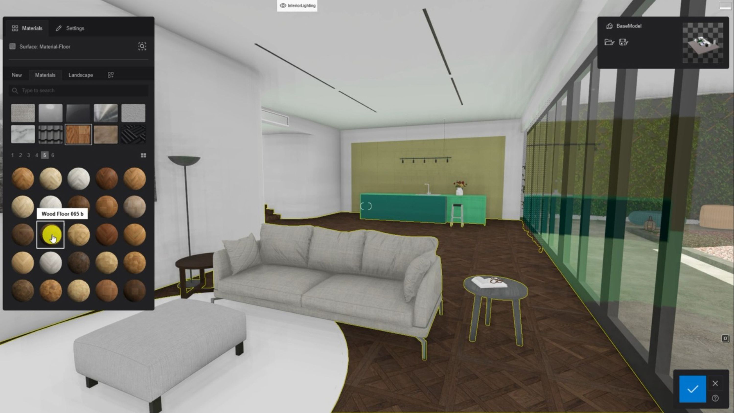
You can see how we tried to keep things simple in our tutorial scene. We took the same approach when selecting materials and would recommend you do too. At least for your first few explorations within Lumion.
In our example, we adjusted mainly the colorization and roughness of the materials. Roughness is crucial for obtaining textures that you want to reach out and touch. Be sure to experiment with this. Our tutorial shows material examples on the floor, ceiling, walls and cabinets.
Build your special effects stack
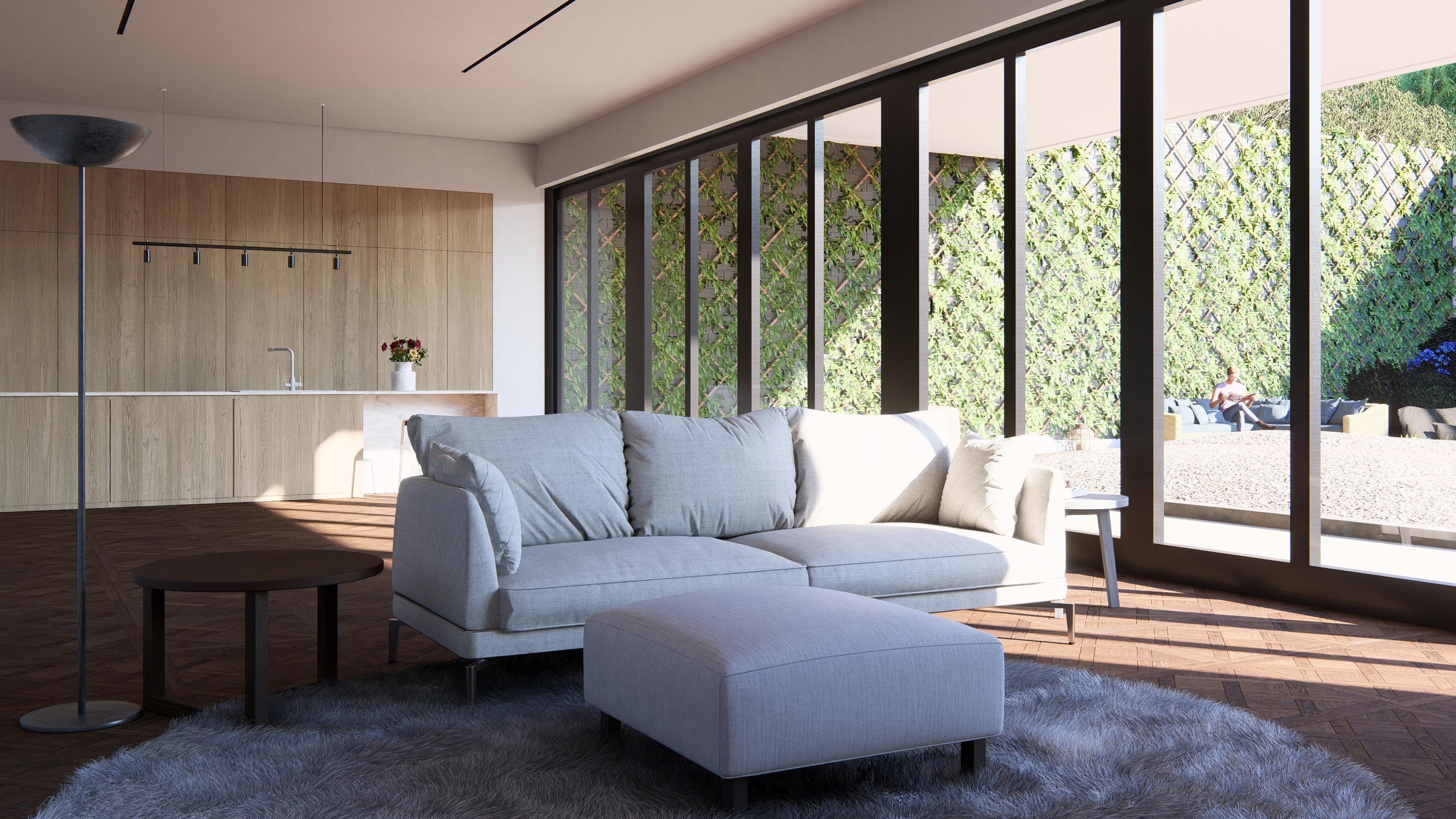
Lumion’s ray tracing technology can dramatically help a render take a leap towards photorealism. Ray tracing (RT) gives a true sense of how lights and materials play together within your design and helps to visualize a true representation of the space.
In our tutorial, we replicated the same trick that we used for the lighting and applied the Interior RT style. With just a couple of small tweaks, we were able to define the exact effect we were looking for. Those tweaks included changing the sun position, along with a little color correction.
Pro tip: When using the ray tracing effect, keep these few guidelines in mind.
The less light you have, the more samples you will need to resolve the image. In our example, 512 was plenty.
The number of bounces will boost the interaction of light with objects. As our scene contained a fair amount of non-reflective surfaces, and we wanted them to harmoniously blend, we maxed this setting out.
For this scene, we put the Denoiser on, and put Firefly Reduction to 0. We would recommend this for any scenario where your interior is well lit.
Play with night scenes
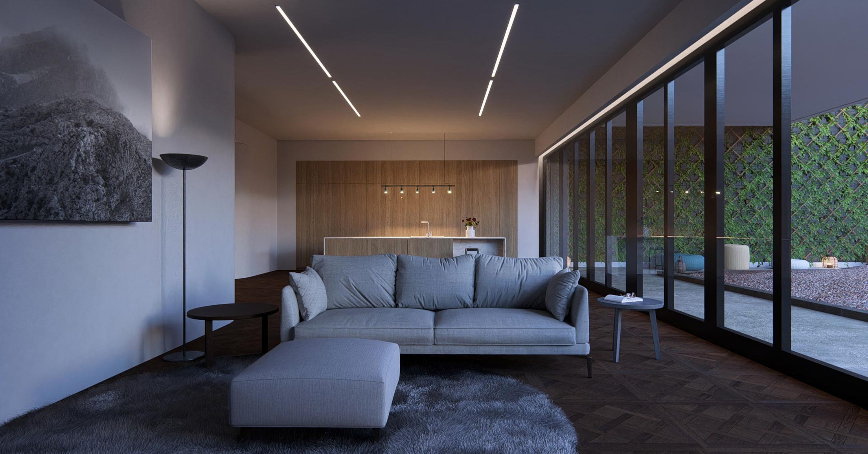
In our tutorial, we showed how quick you can create a night scene. All of our lights were placed on a single layer, to help keep our project clean, and we followed some simple steps to capture our image.
We copy/pasted the photo position from our day shot, and its effects stack.
We altered the Real Skies effect, lowering the sun’s position to create a nice blue-hour look.
We used the Layer Visibility Effect to enable the lights and make them a bit warmer.
We increased the samples of the RT Effect to 1024
We clicked render! That’s how easy it was to build that incredible night shot.
Our tutorial shows how, in under 10 minutes of work, you can achieve incredible results with Lumion. Designing and rendering interiors can be fun and exciting. We're excited to see what you can achieve.
Keep practicing!
