Guide to visualizing landscapes
Discover how to create exciting landscapes in Lumion
Step inside your design
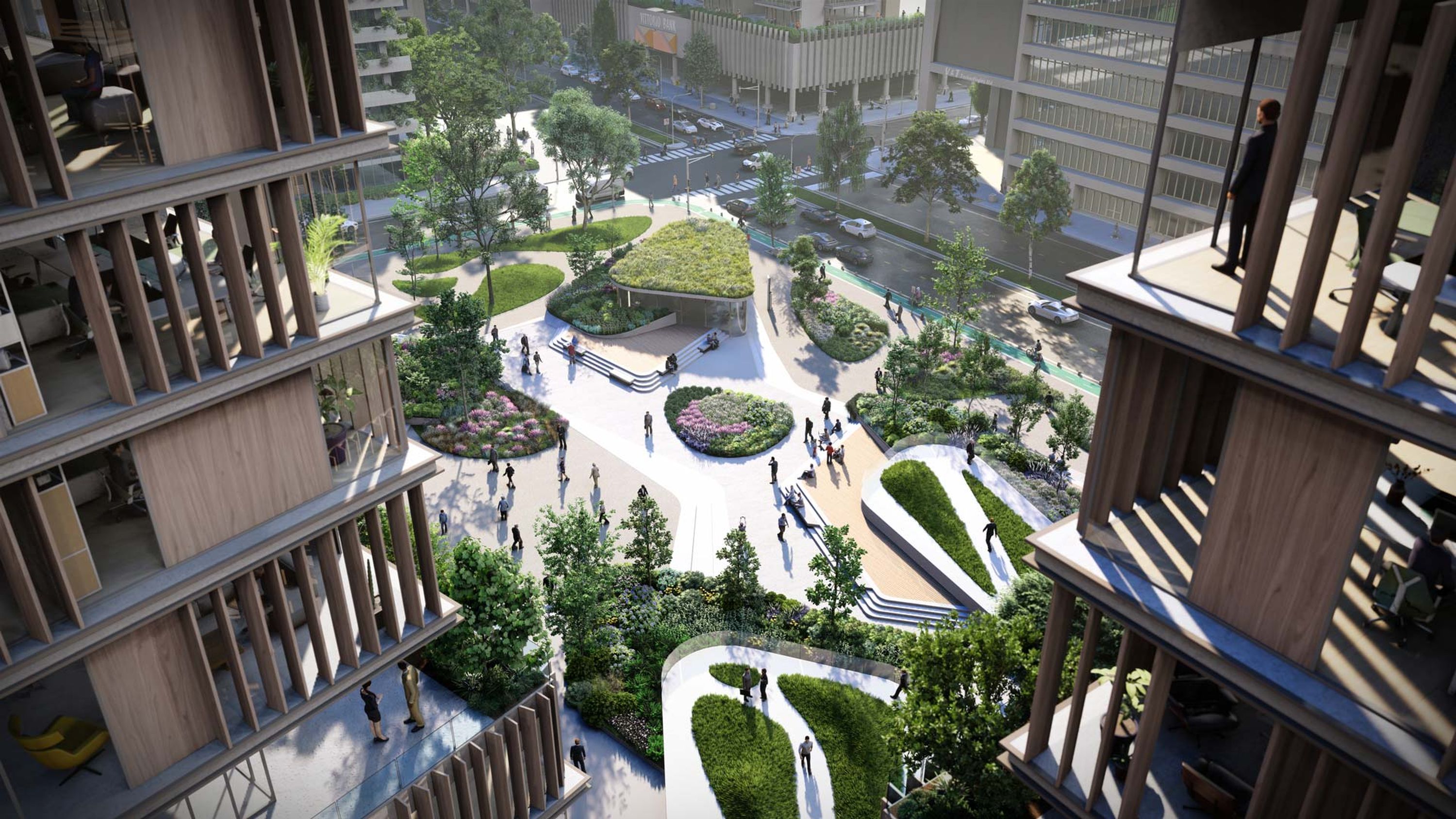
You can render a lot more than just buildings inside Lumion. With Lumion, you’re one step closer to creating landscapes that are nothing short of breathtaking. This guide offers some simple guidelines to follow when building landscape scenes in Lumion. Keep these steps in mind and you’ll be crafting spaces you’ll want to explore in no time at all.
Video tutorial
Scene building basics for landscapes
Watch our video to see how Lumion’s tools can help you easily manufacture a stunning landscape in under ten minutes.
If you wish to follow along with this tutorial, you can download the 3D model, and other resources, here.
Choose your build mode
There are two main approaches to creating landscapes in Lumion. Our tutorial gives insight into both:
The first is a controlled approach, where we build out the garden using exactly what was present and included in the 3D modeling software.
The second, more intuitive approach basically opens up all of Lumion's landscape tools and lets you play around with them. These tools allow for freer, more instinctive creations and give you chance to sculpt the terrain to your liking and experiment further.
Taking a controlled approach
In the tutorial, after we had imported the model, we could see that there were two partially overlapping surfaces in the garden. Here we wanted to create a realistic grass effect.
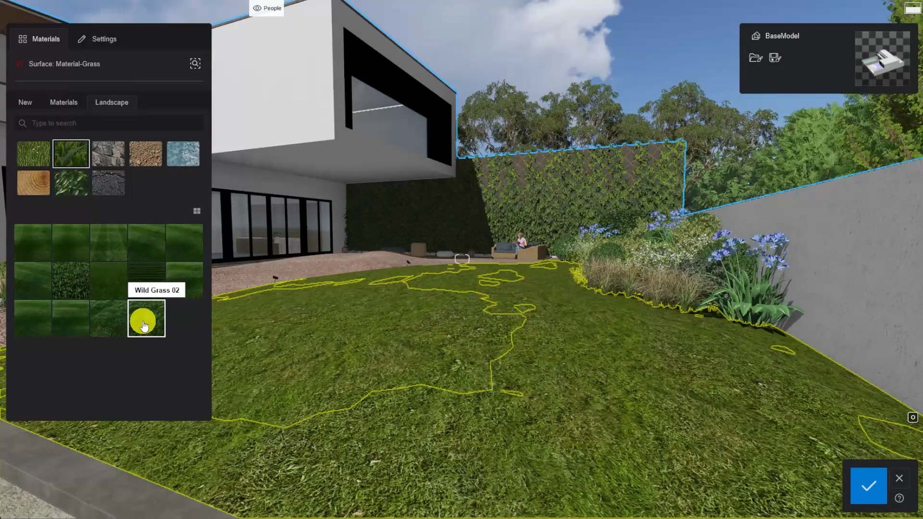
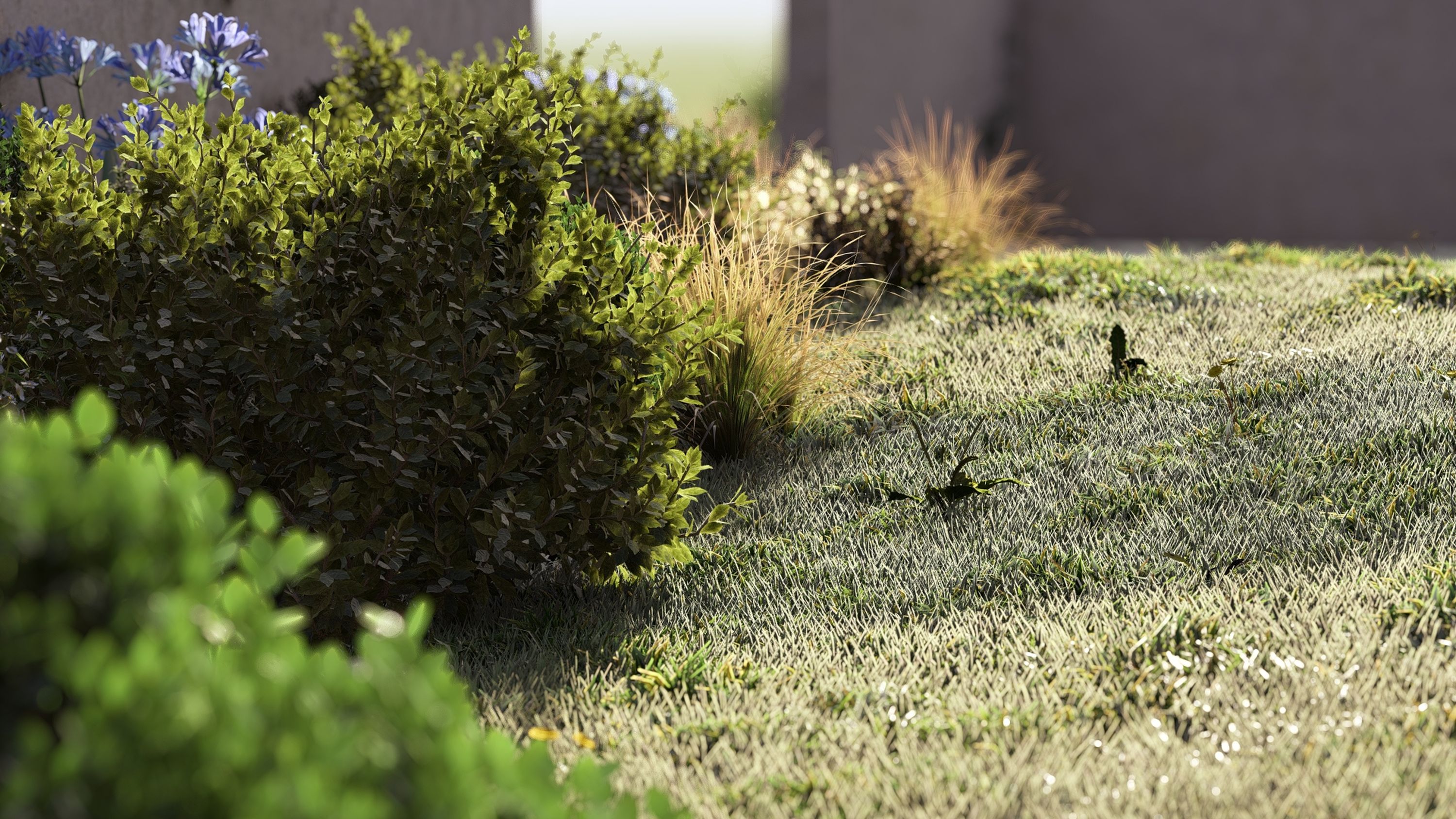
To make grass look realistic, it needs to have patches of different densities, an unequal distribution of blades and differences in color. It’s the details that matter.
But how can you achieve a realistic look if you only have a few minutes to build it because of a tight deadline?
Here’s our pro-tip: make 2 almost identical surfaces and place them so they are almost overlapping. Make one of the layers slightly higher than the other in certain areas. Then, apply the Landscape Grass option to one layer, and 3D Grass onto the other. Then try to match the color, but not quite. That should give you a more realistic result.
Taking an intuitive approach
Here's where you get to really play around and experiment with Lumion!
In the tutorial, we made a variation of our model and turned the grass and gravel surface materials invisible. If you open up the example file and follow along with the tutorial, you will notice that some Lumion Landscape appears underneath.
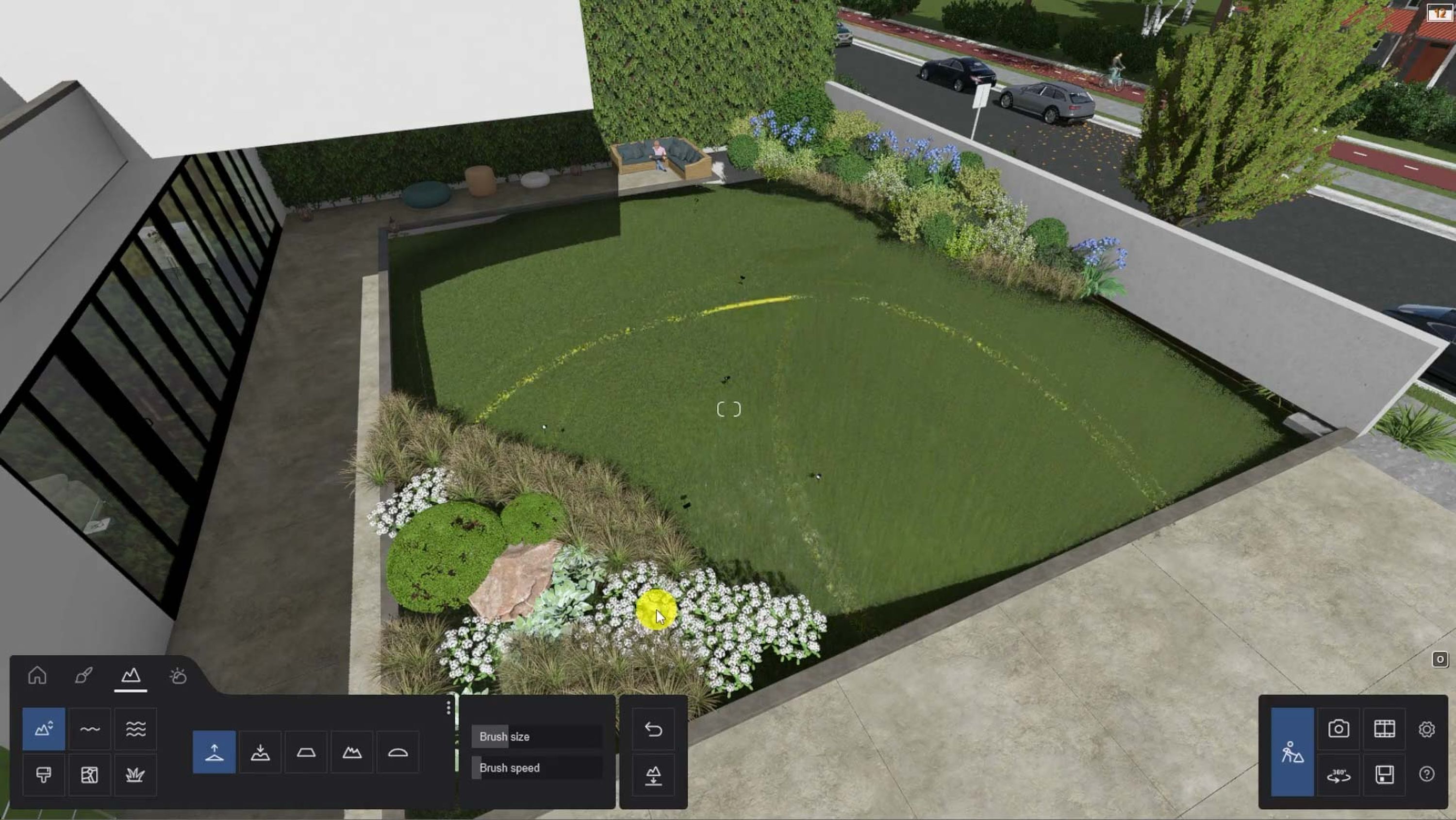
In Landscape mode, you are free to sculpt the shaping of the landscape to your liking using the 5 tools at your disposal. They are all self-explanatory:
Raise
Lower
Flatten
Jitter
Smoothen
If you make a mistake, simply reset your space with the Flatten Landscape. To create the effect in our tutorial, we used Raise to change the height of certain areas, and decreased the brush radius to gain a little more control when sculpting the edges. We had Landscape Grass switched on and that started to work to our advantage.
Although we reverted back to the controlled approach for the remainder of our tutorial, we hope that this section gives you a quick insight into how easy it is to play with Lumion's landscaping tools and shape terrain to your liking.
Place plants with care
In order add a bit of detail and realism, we added some weeds and small plants into the lawn areas.
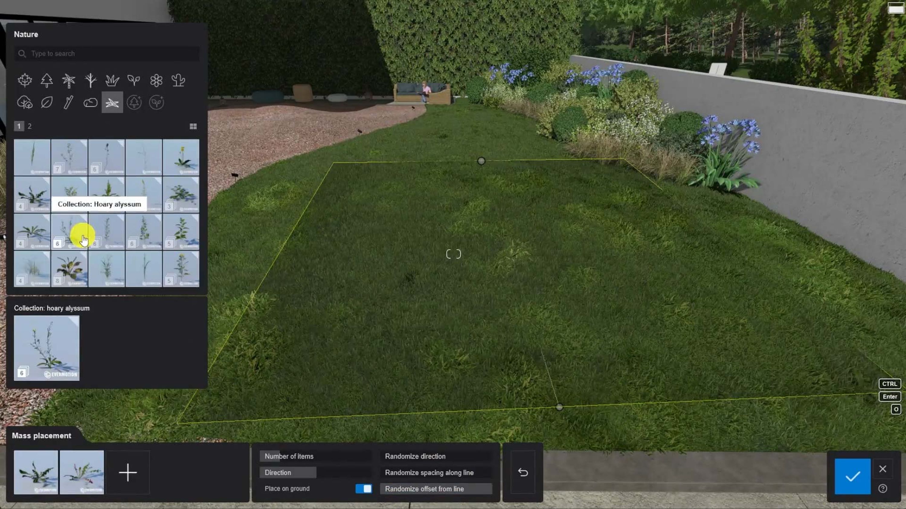
You can select plants in the Library and use the Mass Placement tool to scatter them across the whole of your surface. For some finishing touches, we used the Cluster Placement tool to sprinkle some flowers around and create a more natural look to our lawn area.
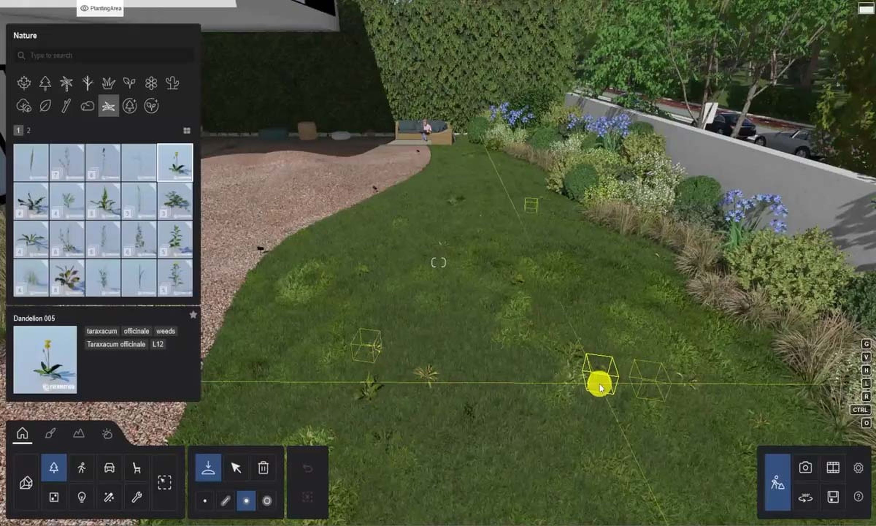
Our tutorial also shows us using the Single Placement tool to add bushes and other items into our scene. It’s just like drawing on a canvas, and fun to experiment with.
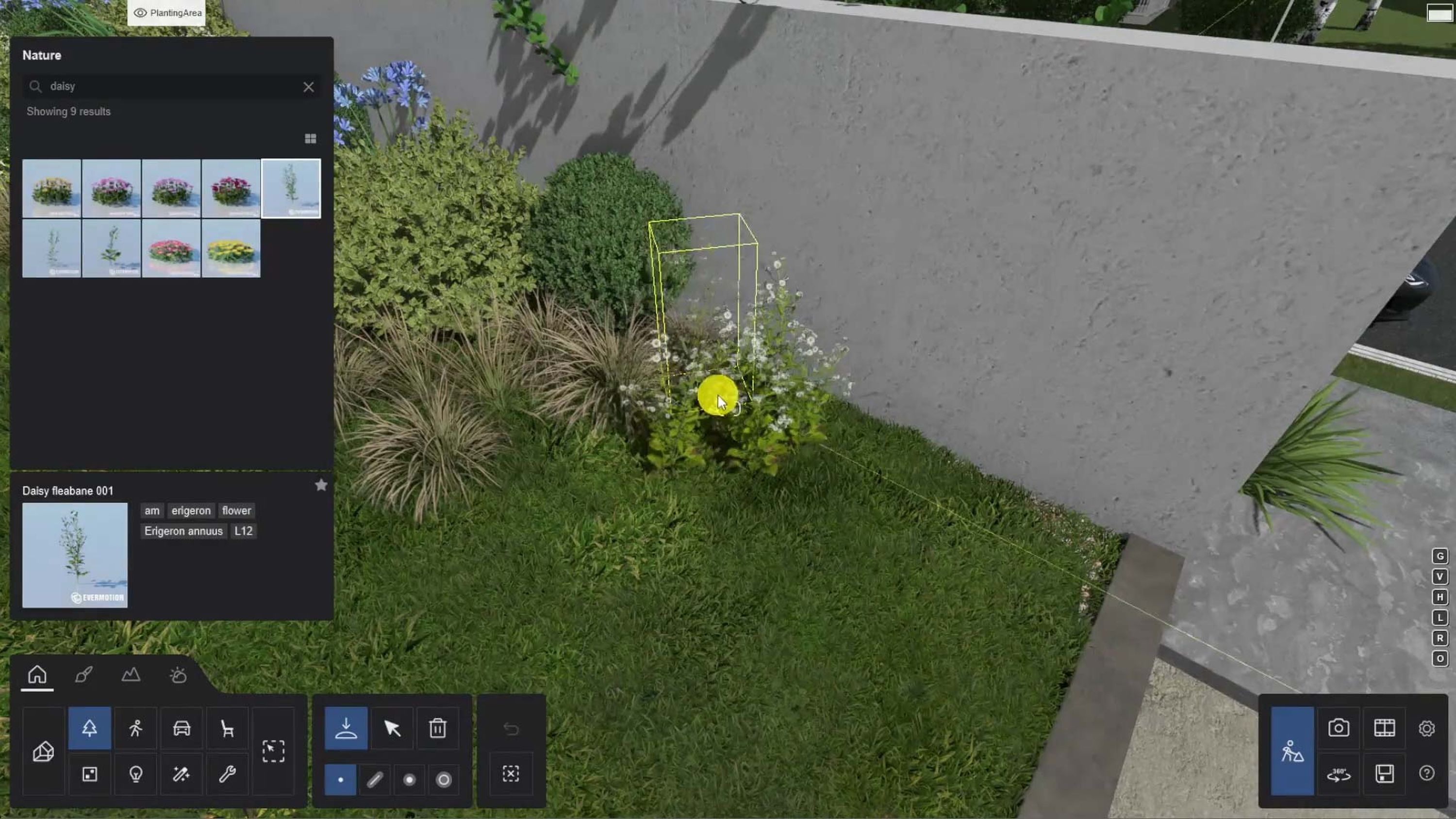
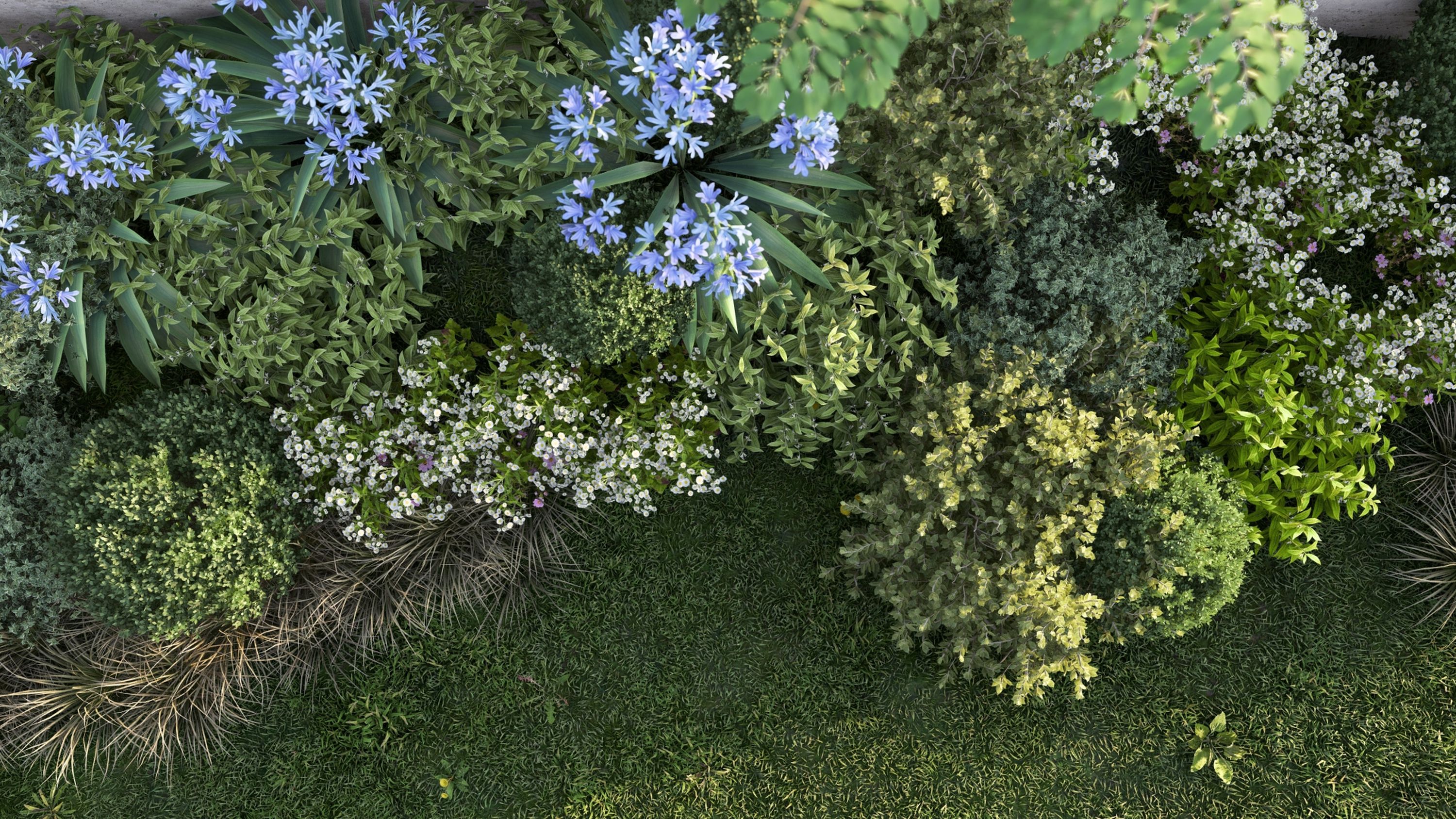
Lumion’s vast collection of trees, bushes, shrubs and plants gives you a wealth of possibilities for populating your landscape areas, so be sure to spend some time getting to know what’s in the Library.
Find the right angle
As with any other aspect of architectural design, creating a stunning Landscape render will require careful camera positioning. While there are no hard and fast rules for landscape composition, we do have some guidelines for framing that you may find useful.
Understand the message you’re trying to convey. Every render you create should be trying to communicate something to the viewer, be that a mood, atmosphere, feature of interest or whatever. Identify your primary subject and make it the focus of your image. While you may have secondary or tertiary elements to support the scene, make it easy for the viewer to properly identify them and compose your shot to guide the viewer through those areas in your chosen order.
Try not to place your primary subject in the center. Check out the rule of thirds and give it a try.
Look for shapes and curves that can guide the eye. S curves in particular are very pleasing to the eye.
Balance your shot through symmetry. Try to keep a balance across the different parts of your image.
Look for patterns and lines that you can use to guide the viewer’s eye
Use elements in the scene to add depth. Sometimes you’ll find a great angle by positioning different items in your scene in order to add depth to the final image.
Be careful with dark shadows. Don’t let them dominate the scene. With landscape images, shadows can easily steal the viewer’s attention. Experiment with sun angles and exposure settings to keep a sense of balance throughout the image
We found some interesting angles in our tutorial that enabled us to focus on the landscape and for a final extra touch, we added the Precipitation Effect, to make things glisten and shine a little more. After that, we were able to press render and let Lumion do its magic!
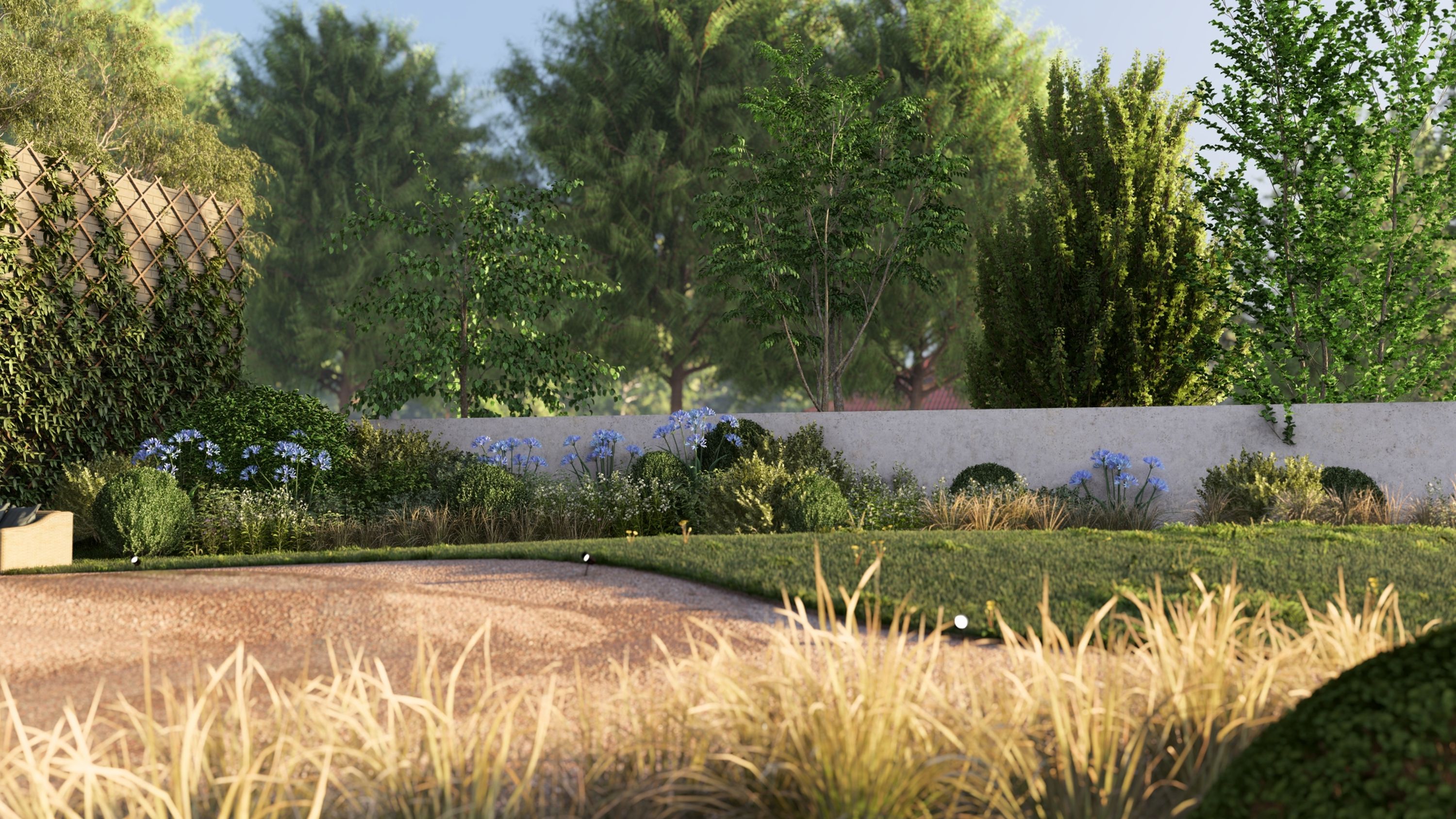
With just a few minutes work, you can create stunning landscapes in Lumion. And with more time to play with, you can scale up the size and complexity of your landscapes with ease. The possibilities are endless and the results are impressive. Use your trained architect’s eye to make the most of what Lumion has to offer. We can’t wait to see what you create.
Keep practicing!
