How to create architectural presentation boards
Top tips to communicate your design clearly & effectively
Designs that speak for themselves
Architectural presentation boards are a vital tool for showcasing your designs to clients and stakeholders. Through thoughtful composition and clear hierarchy, they highlight the key elements of your design, guiding the viewer’s attention and ensuring your vision is both understood and remembered. By combining technical details with artistic storytelling, these boards effectively communicate a design’s intent, purpose, and evolution in a clear and engaging way.
Often comprising drawings, diagrams, images, and animations, these displays can be curated in a variety of ways in order to best communicate your ideas and decisions. In Lumion Pro, you can create and arrange personalized presentation boards that distill complex concepts into simple visual representations, allowing viewers to quickly grasp the essence of your design.
We previously put together some top tips for producing custom architectural drawing packages in Lumion Pro. In this follow-up guide, we’ll show you how to create dynamic presentation boards that illustrate your projects' full potential.
Let’s dive into some of Lumion Pro’s most useful tools and effects, along with practical tips for using them effectively.
Orthographic views
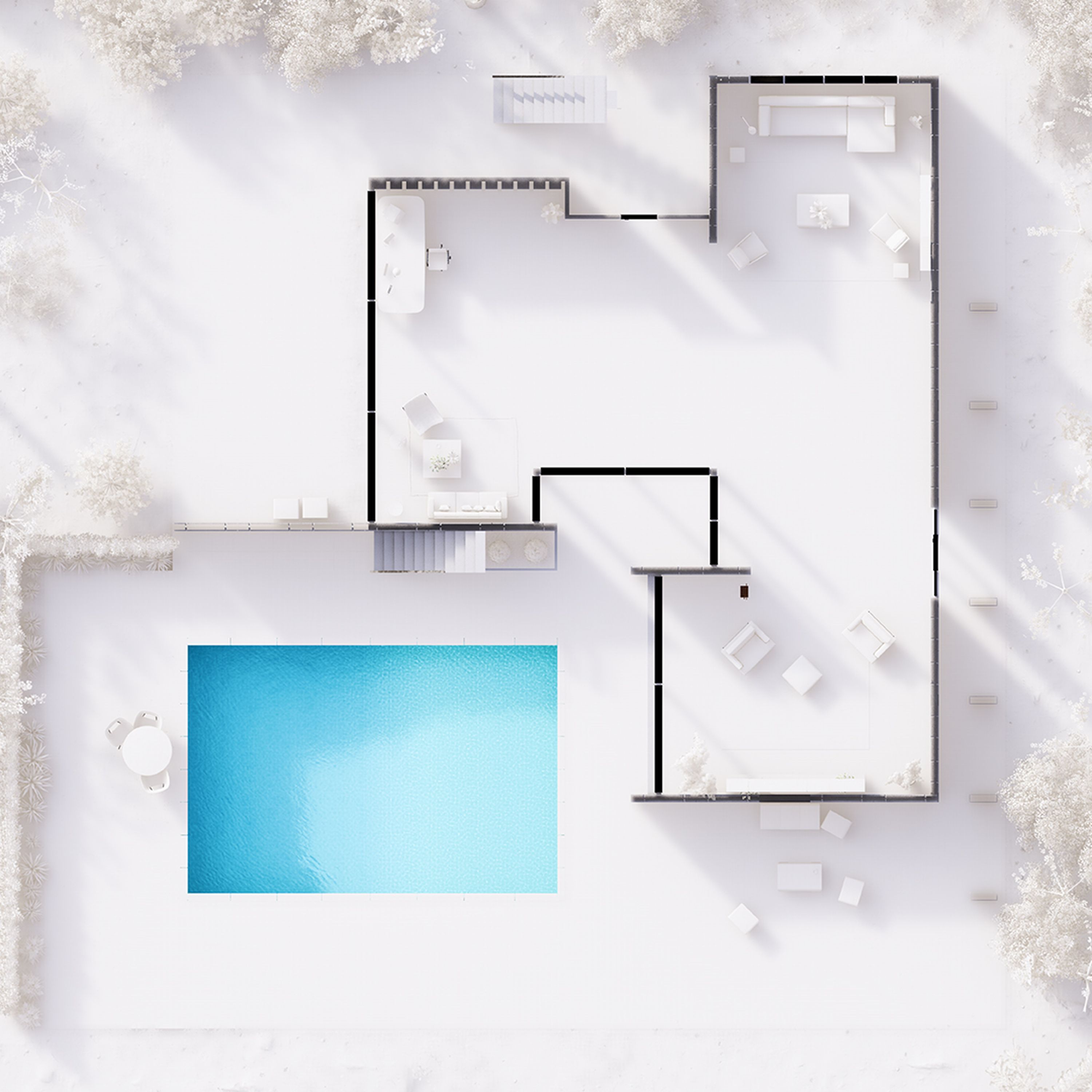
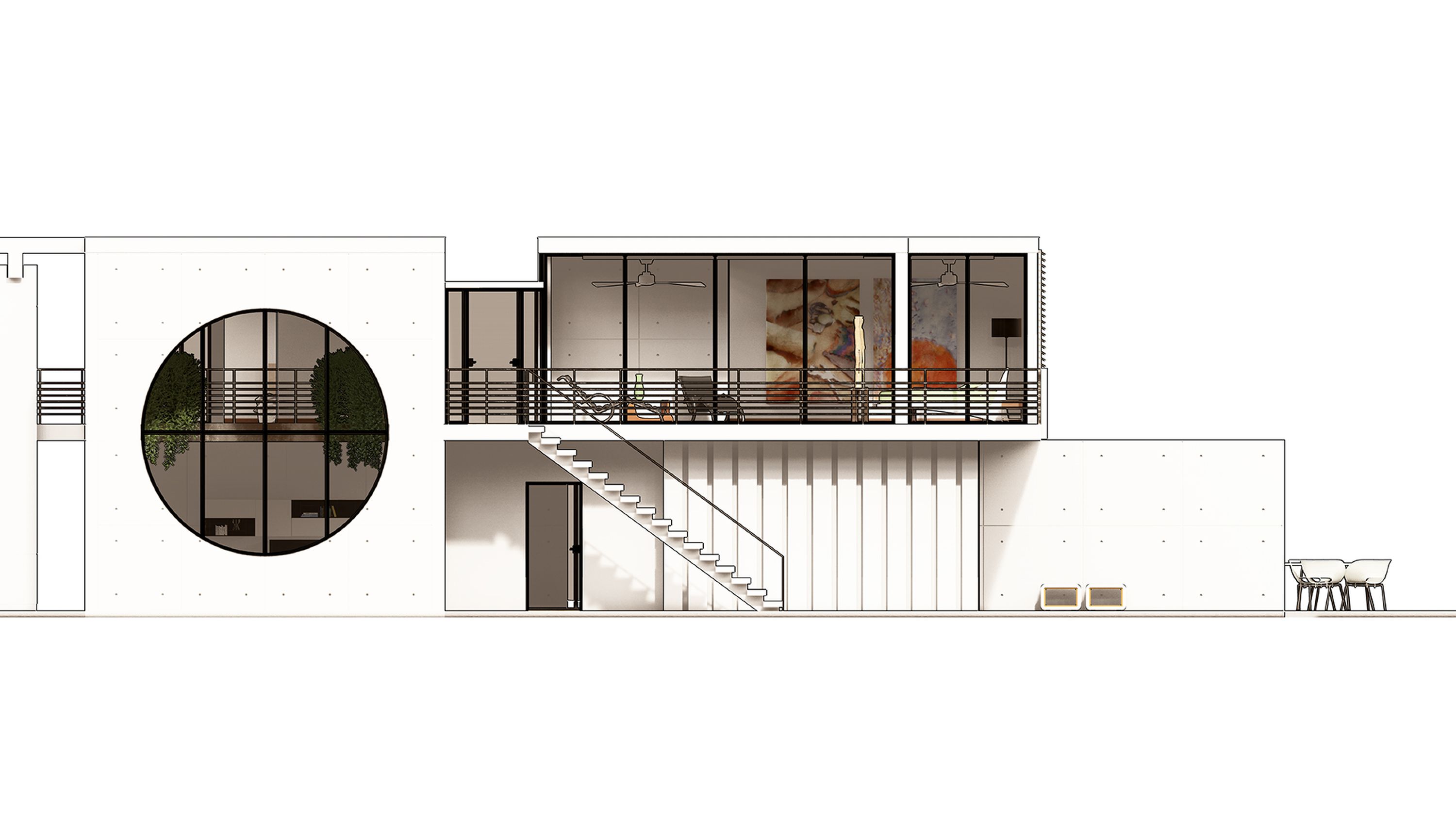
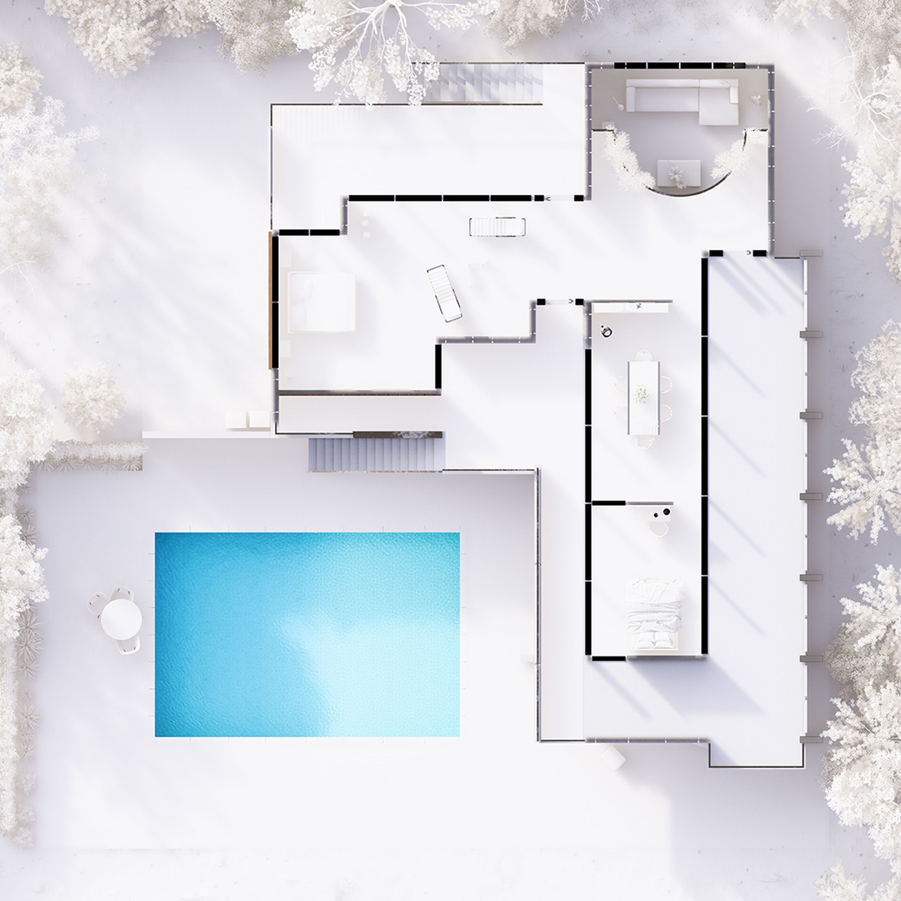
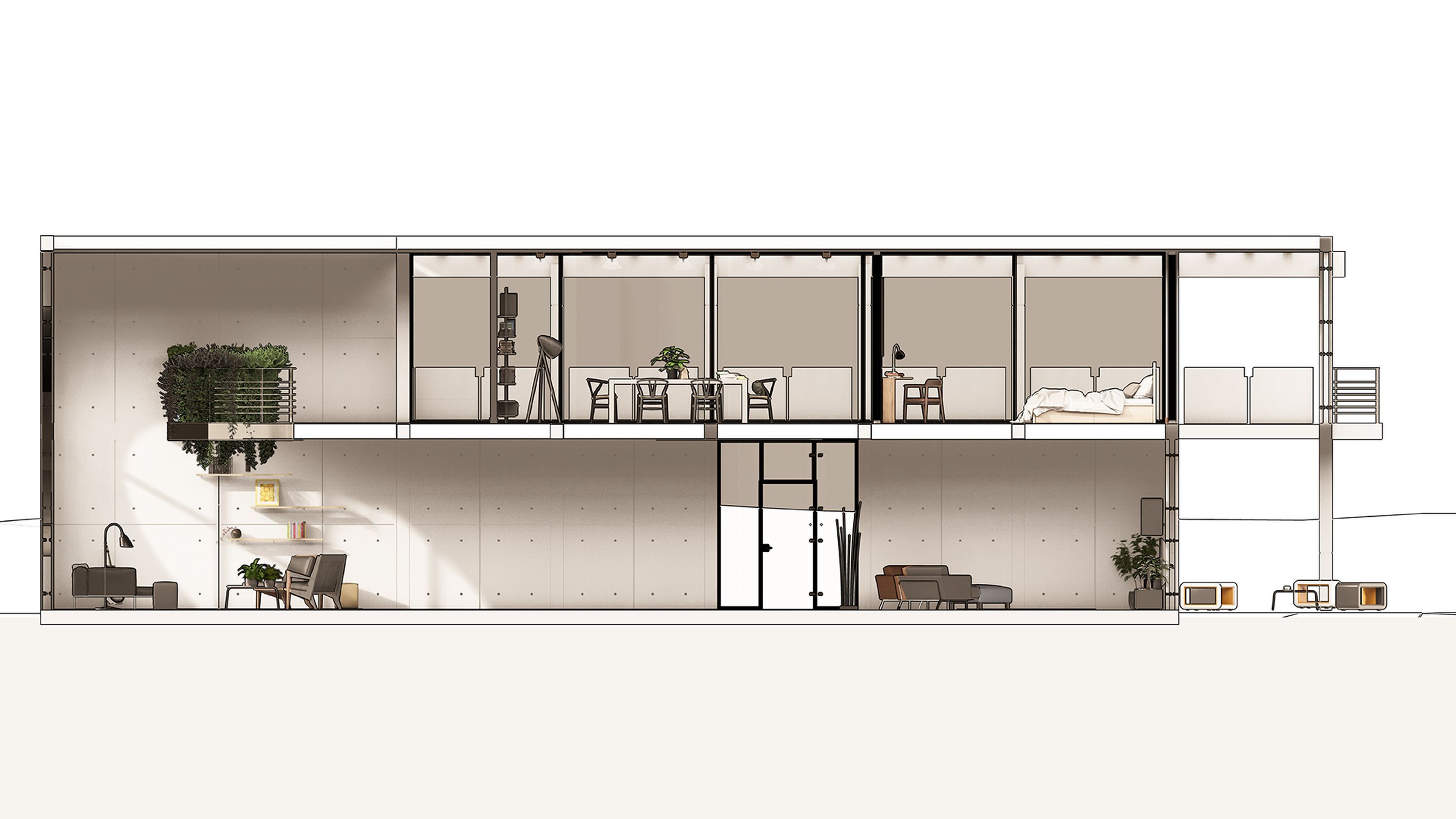
Every design requires fundamental 2D drawings: plans, sections, and elevations. Producing these in Lumion Pro is effortless, thanks to the Orthographic view effect. This effect not only enables you to create precise 2D representations but also features a clipping slider, allowing you to cut through your project at any point to produce detailed sections.
You can then fill in the sectioned areas with a color or material of your choice for a clean, customized look.
You can also switch between 2D and 3D views within the effect. In 3D mode, you can produce detailed visuals like one-point perspectives or section perspectives. A section perspective combines the spatial clarity of a cross-section with the depth and realism of a perspective, providing a dynamic and comprehensive understanding of a building’s interior and spatial relationships.
Remove the background
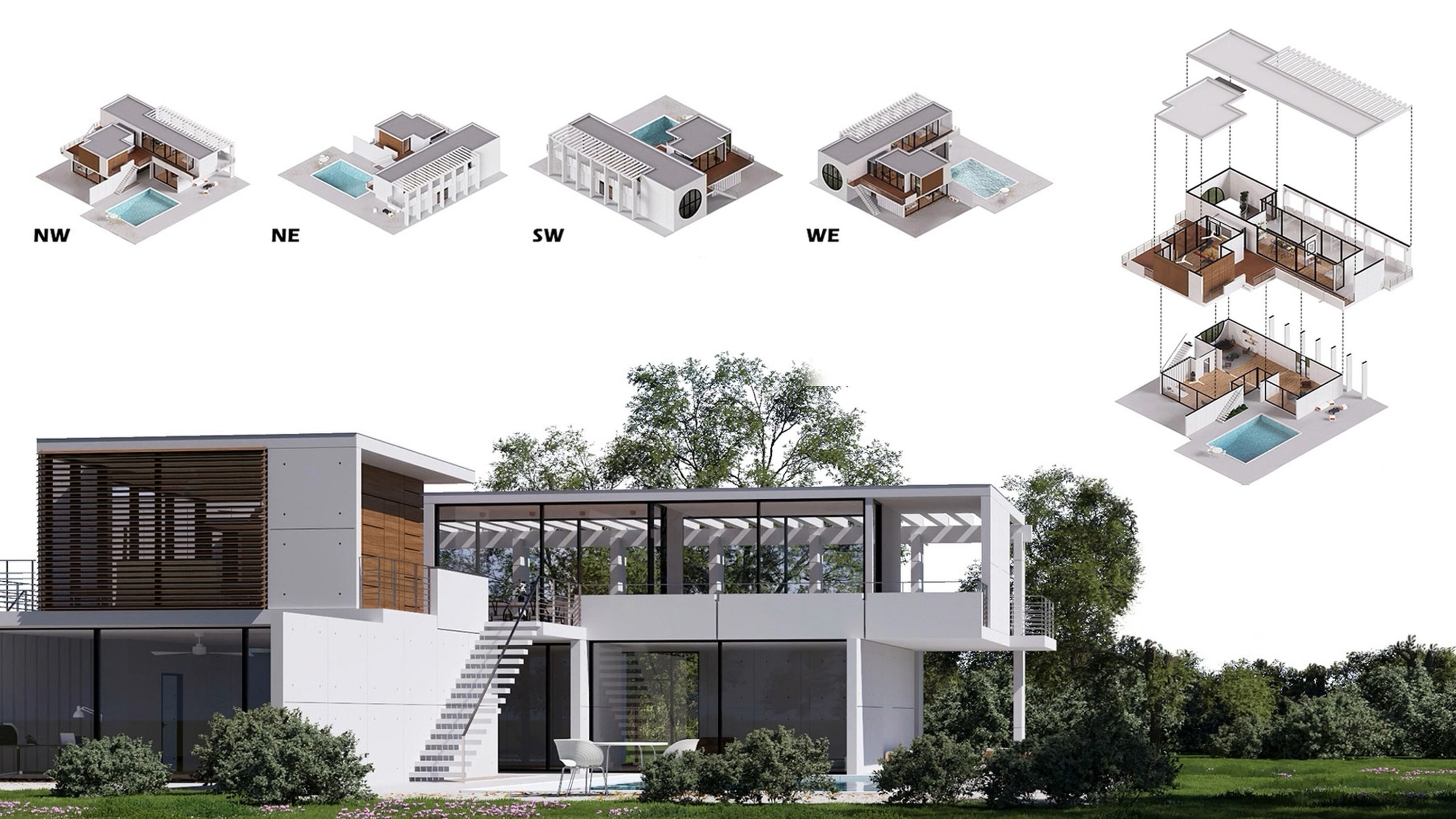
Accurate diagrams, such as massing diagrams and exploded axonometric views, offer a fantastic way of communicating the thought process behind a concept. In order to make sure they achieve this as effectively as possible, it’s often a good idea to remove the context surrounding your design. With a blank background, the spotlight is firmly on your design—its massing, materiality, and other important elements are plain to see, without any distractions.
Lumion Pro’s Remove background effect makes it easy to isolate your design and replace the sky and landscape with a solid color of your choice. A clean, minimal backdrop ensures that the features you want to highlight take center stage.
Plus, this effect works seamlessly in photo, movie, and panorama modes, giving you the flexibility to use it across various types of presentations.
For an added touch of interest and movement, consider incorporating simple animations to bring your diagrams to life.
This effect is particularly useful for creating a wide range of diagram types, such as concept diagrams, site analysis diagrams, circulation diagrams, zoning diagrams, massing diagrams, and exploded axonometrics. Its ability to simplify the background ensures your diagrams remain clean, clear, and focused on what matters most.
Customize details
Each architectural presentation board shows a unique set of ideas, which is why it’s important to personalize every aspect of them.
When using the above two effects to create your boards, there are multiple ways you can add a personal touch.
When customizing plans and sections, you can combine the orthographic view effect with other styles and effects to help you get the exact look and feel you want. Adding the styrofoam effect offers striking visual appeal, thanks to its contoured outlines, and also allows you to control the amount of detail you want to reveal. You can use it to remove materiality and keep focus on the massing, for example.
With clipping planes, you can tailor the appearance of the sectioned areas on display in your architectural drawings by selecting a custom color or assigning a material. This option makes section views look complete and cuts down on any post processing you might have required.
When it comes to the remove background effect, the choice of backdrop color is entirely yours, as well as the option to influence the tone of the lighting and shadows. This allows you to get as creative as you like with your diagrams and play with contrast on your boards.
Curious to try for yourself?
Start with a 14-day Lumion Pro trial to explore all this and more—completely free.
Perfecting layouts & visual flow
Creating an architectural presentation board is about more than just showcasing your designs—it’s about presenting them in a way that’s clear and engaging. A well-thought-out layout, strong visual hierarchy, and consistent style can make all the difference.
Here are some useful tips to help you put it all together:
Arrange elements in a logical order: Architectural designs are typically read from left to right and top to bottom. Follow this flow to organize your presentation:
Type of project/brief and relevant research
Site plan
Concept and development: include the main design idea illustrated with sketches, the primary volumes of the design proposal shown through massing diagrams, and various spatial usages demonstrated with zoning diagrams.
Top view and floor plan(s)
Sections
Elevations
3D visuals
Construction details
Use white space thoughtfully: Create a clean, balanced layout that allows your designs to breathe. Avoid overcrowding the boards while ensuring CAD/BIM drawings are scaled clearly and accurately to showcase all necessary details.
Leverage grids for organization: Whether digital or printed, use a grid in your design software to structure the hierarchy of elements. This ensures consistency in scale and alignment across all boards.
Keep graphic styles consistent: Stick to a unified style for fonts, explanatory text, and colors across all boards. This consistency not only ensures clarity but also helps make your boards visually distinctive and reflective of your design aesthetic.
Create your own presentation board
An architectural presentation board is more than just a collection of visuals—it’s a powerful way to tell the story of your design in a way that captivates and informs. With Lumion Pro’s intuitive features, like orthographic views, the remove background effect, and presets, you can effortlessly craft presentation boards that showcase your projects with clarity, style, and impact.
Take the first step today with Lumion Pro’s free 14-day trial. Explore these features and more, experiment with your designs, and discover how easy it is to create presentation boards that truly stand out.
